Today Microsoft released the latest version of SPFx (v1.15). This version comes with the feature that I waited most for (and probably many SharePoint developers). This is a possibility to create a “native” list item custom form.
Until this day, it was a very hacky process of making a custom webpart and redirecting users to it by using custom actions or list view JSON customizers. Now, this development model is fully supported by SPFx.
In this article, you will get to know how to build a simple form, test it, and deploy it to the site.
How to create a form customizer component?
Update the SPFx generator to the newest version
npm install @microsoft/generator-sharepoint@latest --global
Create a new directory for the project and open it in a terminal then run the command
yo @microsoft/sharepoint
Follow the instructions on the screen. The new customization type is available under Extension -> Form Customizer. In this example, I choose to create a React form.

Created SPFx project
Now the generator will create the project and install all dependencies. When it is done a standard SPFx project structure is created. You can find the customizer in the src/extensions/{customizerName} directory.

Let’s jump to the customizer component and see what we got here.

It looks very similar to the web part component. There are onInit for initialization, render for rendering the form and onDispose for a clean-up. The new things are displayMode which indicates if it is the display, edit or the new mode, self-explanatory properties like list, contentType or itemId, and formSaved() with formClosed() to tell the SharePoint that we finished the job in our form.
As I selected React as my framework, the React form component was created as well. By default, it is a pretty empty place.

Creating a simple form
As the form was created, now it is time to add some logic to it. In this example, there is a very simple list with just a title field. SPFx does not give you an API to get, create or edit a list item. Of course, there is SPHttpClient in the component context and you can build requests to SharePoint REST manually, but it is a verbose task. The more friendly way to do it is to use the @pnp/sp library. Add this library to your project.
npm install @pnp/sp --save
The library has to be initialized. The best place to do it is the onInit() method of the form customizer.
// MyFirstSpFxFormFormCustomizer.ts

import {spfi, SPFx, SPFI} from '@pnp/sp'

...
class MyFirstSpFxFormFormCustomizer
    extends BaseFormCustomizer<IMyFirstSpFxFormFormCustomizerProperties>  {

  private sp: SPFI;

  public onInit(): Promise<void> {
    this.sp = spfi().using(SPFx({ pageContext: this.context.pageContext }));
    return Promise.resolve();
  }
}
Pass the newly created @pnp/sp instance to the React component in the render() method.
// MyFirstSpFxFormFormCustomizer.ts

...
public render(): void {
    // Use this method to perform your custom rendering.

    const myFirstSpFxForm: React.ReactElement<{}> = React.createElement(
      MyFirstSpFxForm,
      {
        context: this.context,
        displayMode: this.displayMode,
        sp: this.sp,
        onSave: this._onSave,
        onClose: this._onClose,
      } as IMyFirstSpFxFormProps
    );

    ReactDOM.render(myFirstSpFxForm, this.domElement);
  }
The whole form logic is in the React form component. These days I prefer to work with functional components with hooks. So my component now looks like this.
// MyFirstSpFxForm.tsx

export interface IMyFirstSpFxFormProps {
  context: FormCustomizerContext;
  displayMode: FormDisplayMode;
  sp: SPFI;
  onSave: () => void;
  onClose: () => void;
}

export default function MyFirstSpFxForm({
  context,
  displayMode,
  sp,
  onSave,
  onClose,
}: IMyFirstSpFxFormProps) {
  return <div className={styles.myFirstSpFxForm} />;
}
It is much simpler now. Add some generic form logic to it, and it should be similar to this.
// MyFirstSpFxForm.tsx

import { FormDisplayMode } from '@microsoft/sp-core-library';
import { FormCustomizerContext } from '@microsoft/sp-listview-extensibility';
import * as React from 'react';

import {
  DefaultButton,
  PrimaryButton
} from 'office-ui-fabric-react/lib/Button';
import { Stack } from 'office-ui-fabric-react/lib/Stack';
import { TextField } from 'office-ui-fabric-react/lib/TextField';

import { SPFI } from '@pnp/sp';

import '@pnp/sp/items';
import '@pnp/sp/lists/web';
import '@pnp/sp/webs';

export interface IMyFirstSpFxFormProps {
  context: FormCustomizerContext;
  displayMode: FormDisplayMode;
  sp: SPFI;
  onSave: () => void;
  onClose: () => void;
}

interface MyListItem {
  Id?: number;
  Title?: string;
  'odata.etag'?: string;
}

export default function MyFirstSpFxForm({
  context,
  displayMode,
  sp,
  onSave,
  onClose,
}: IMyFirstSpFxFormProps) {
  const [listItem, setListItem] = React.useState<MyListItem>({});

  const isViewForm = React.useMemo(
    () => displayMode === FormDisplayMode.Display,
    [displayMode]
  );

  const onInputChange = React.useMemo(
    () => (e: any, value?: string) =>
      setListItem({ ...listItem, Title: value }),
    [listItem, setListItem]
  );

  const saveForm = React.useMemo(
    () => () => {
      (async () => {
        const listItems = sp.web.lists.getById(
          context.list.guid.toString()
        ).items;
        const update = { Title: listItem.Title };

        if (!listItem.Title) {
          return alert('Title is required');
        }

        try {
          if (!context.itemId) {
            await listItems.add(update);
          } else {
            await listItems
              .getById(context.itemId)
              .update(update, listItem['odata.etag']);
          }
          onSave();
        } catch (error) {
          alert('Error during saving the list item');
        }
      })();
    },
    [listItem, context.itemId, context.list.guid, sp]
  );

  React.useEffect(() => {
    (async () => {
      if (context.itemId) {
        const item = await sp.web.lists
          .getById(context.list.guid.toString())
          .items.getById(context.itemId)<MyListItem>();

        setListItem(item);
      } else {
        setListItem({ Title: '' });
      }
    })();
  }, [context.itemId, context.list.guid, displayMode, sp]);

  return (
    <Stack
      tokens={{
        childrenGap: 15,
        padding: 15,
      }}
      styles={{ root: { maxWidth: 500 } }}
    >
      <span>ID: {context.itemId || 'new'}</span>
      <TextField
        label="Title"
        value={listItem.Title}
        onChange={onInputChange}
        readOnly={isViewForm}
      />
      <Stack
        horizontal
        tokens={{
          childrenGap: 5,
        }}
        horizontalAlign="end"
      >
        {!isViewForm && <PrimaryButton onClick={saveForm}>Save</PrimaryButton>}
        <DefaultButton onClick={onClose}>Close</DefaultButton>
      </Stack>
    </Stack>
  );
}
Debugging the form in a browser
The basic form is ready, and we are eager on testing it. Before trying out how the customizer works you need to change the serve configuration. To do this, edit the config/serve.json file and replace all occurrences of https://contoso.sharepoint.com/sites/mySite with the URL of your test site and /sites/mySite/Lists/MyList with the server relative URL of the test list that you are using. Your final config should be similar to this.

Now you can run the project with
npx gulp serve
The browser should open a development page asking for allowing debug scripts.

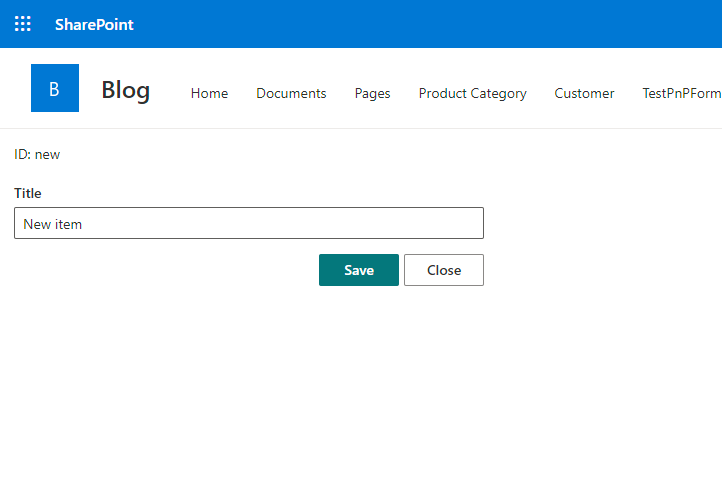
After allowing debug scripts our form should be opened and ready to add a new item.

Fill out the title field and click the save button. The form should be closed and a new item is added to the list. So, we got the first big milestone here! The form has created a list item.

Let’s check if the form works correctly in the “View” mode. Stop the running serve command and run the view form debugging.
npx gulp serve --config=myFirstSpFxForm_ViewForm

Another successful test! So the last one left. You can try if you can edit an item. Again, stop the serve and run:
npx gulp serve --config=myFirstSpFxForm_EditForm

The item loads, now try to edit it and save changes.

It works! This is your first SPFx form customizer.
Customizer deployment
To deploy the component you need a content type and update its custom form-related properties. Microsoft introduced these new properties on the content type model:
| Property | Description |
|---|---|
| NewFormClientSideComponentId | component id for new form |
| NewFormClientSideComponentProperties | optional configuration details |
| EditFormClientSideComponentId | component id display form |
| EditFormClientSideComponentProperties | optional configuration details |
| DisplayFormClientSideComponentId | component id display form |
| DisplayFormClientSideComponentProperties | optional configuration details |
You can use various ways to change the content type properties.
- Content-type as part of SPFx package,
- Content-type as part of PnP provisioning template,
- Changing content-type properties with REST or CSOM,
- PnP PowerShell (limited).
In this article, I will show you how to use the last option on the list above. In fact, it is a combination of using PnP PowerShell to get the access token and making an HTTP request to SharePoint REST API manually. For now, there is no built-in method supporting new content type properties.
The deployment starts with building the SPFx solution. The SPFx has some very strict linter rules that will stop us from packaging this solution. For this simple PoC purpose add this line to gulpfile.js. Please do not use this in a production environment.
build.addSuppression(/.*/g);
Next, you can run this command.
npx gulp bundle --ship && npx gulp package-solution --ship
You can find the build package in the sharepoint/package-name.sppkg directory. Upload the package to a tenant or site-scoped app catalog.

To make the customizer on a SharePoint site you need to add the app. On the home page click the “new” button and select “App”.

On the next page click the “Add” button next to the solution.

When you will see the success alert, go to site settings and select the content-types option. Then create a new content type.


After creating a content type, copy the content-type ID value from the confirmation page.

Leave the browser for a moment, now it is time for some PowerShell. Connect to a SharePoint site.
Connect-PnPOnline -Url https://tenantname.sharepoint.com/sites/SiteName -Interactive
Get the created content type ID and the component ID from the MyFormCustomizer.manfiest.json file
$contentTypeId = "0x01003D4C996DABD4694BA215125F3C268050"
$componentId = "83b57037-dfde-4ad3-9ab0-0274c6e26193"
$token = Get-PnPAccessToken -ResourceUrl "https://tenantname.sharepoint.com/.default"

$body = @{NewFormClientSideComponentId = $componentId; EditFormClientSideComponentId = $componentId; DisplayFormClientSideComponentId = $componentId} | ConvertTo-Json

Invoke-RestMethod -Method Patch -Uri "https://tenantname.sharepoint.com/sites/SiteName/_api/web/contenttypes('$contentTypeId')" -Headers @{ Authorization = "Bearer $token"; "Content-Type" = "application/json" } -Body $body
You can close the PowerShell window. Assign the newly created content type to a list. To do this go to List settings -> Advanced settings. Change “Allow management of content types?” to “Yes” and save changes.

Now “Content Types” section in the list settings is visible. Click the “Add from existing site content types” action. On the next page select the previously created content type and click “Ok”.

It is a good idea to hide the default content type. To do this click the “Change new button order and default content type” link and change the settings to the following.

Now you can try it out by creating a new item. The freshly created form customizer should be your new list form 🥳
The tooling at this stage is a little cumbersome. Nevertheless, today is the go-live day of this feature 👍